Healthy Living Within Arm’s Reach
Product Design Case Study
TLDR;
Three early-career UX designers created a mid-fidelity prototype for a client’s social impact mobile app.
Our team aimed to simplify the overall experience as the client prepared to onboard thousands of new users after securing funding from a government contract.
Background
The client, Tangelo, felt their mobile app was overly complex, often leading to frustrated users. They wanted to reimagine the customer experience.
Tangelo’s mobile app aims to help people from under-served populations access healthy food. The company’s ultimate goal is to eradicate food insecurity and diet-related illnesses. Their mantra is: food is medicine.
Bottom Line: Users needed a reliable and efficient way to access healthy food, educational resources, and funding to pursue healthier lifestyles and feel in control of their lives.
Discover
We didn’t know much about Tangelo or the food assistance landscape, so we took a holistic approach to our research.
This initial discovery included:
Client Interview
Current State Analysis
Competitive Analysis
Comparative Analysis
User Interviews
Client Interview
Tangelo leverages a unique, four-pronged approach to address food insecurity.
E-commerce, including a mobile marketplace and door-to-door delivery
Free educational resources
Access to funding for healthy food
Inclusive community
Current State Analysis
The client provided us access to 2 different “programs” or user flows within the mobile app.
Our team combed through both programs and identified potential design opportunities:
The "meatball menu was limited to account settings and logout.
The Explore section was a “catch-all” and felt duplicative.
Content was static and felt overloaded in some categories.
The Wallet had multiple or separate balances.
Transactions only appeared after the first order was made.
The Market layout was crowded and included vague descriptions.
The Chat displayed delivery details after the order was submitted.
Competitive Analysis
Tangelo didn’t seem to have a direct competitor so we needed some guidance from the client.
The client confirmed that their platform was uniquely positioned to address food insecurity so we did not complete a competitive analysis.*
*Note: Towards the end of the project, it was revealed that Tangelo was approved to accept SNAP EBT cards directly on the mobile app. This meant that, at least for the SNAP program, Tangelo did have more direct competitors such as Walmart and Amazon.
Comparative Analysis
We explored 3 mobile apps known for successfully empowering users to take positive steps towards improving their health.
Our goal was to understand: (1) the types of content people are interested in regarding health; and (2) the types of data people are willing to share, log, and track. We identified the following apps:
Achievement - incentivizes positive behaviors through activity
Apple Health - allows users to track tailored metrics easily
Headspace - guides users in changing behavior
User Interviews
Initially, the client was hesitant to connect us with actual users who represented vulnerable populations.
Because the client understood how frustrated users might feel, they also wanted to protect us to some extent. We understood their concerns and emphasized that those reasons were why we needed to talk to actual users.
The client agreed and identified a select pool of users with limited experience with the app. Our team conducted 9 remote user interviews and ensured they were kept anonymous and confidential.
Our research goals were to understand:
User experiences with Tangelo
Perceptions of healthy lifestyles
Existing behaviors around nutrition, purchasing food, and cooking
Typical phone use
Levels of involvement in and/or the importance of community
My primary responsibilities included:
Conducting stakeholder interviews
Reviewing and editing transcripts
Creating a spreadsheet to organize key insights
Define
We went into this project thinking we would focus most of our efforts on the Market feature, but our research significantly shifted our scope.
Surprisingly, many users hadn’t opened the mobile app since they initially downloaded it because they didn’t know what to do with it. They had no idea Tangelo offered anything more than a free, one-time order fulfillment.
So, while we would have loved to redesign the Market and build out all the features the client wanted, we realized that the product would not be useful if no one knew what it does and what capabilities they have within it. Our new goal was to effectively communicate Tangelo’s mission.
To help further define the project scope, we did synthesized our research, developed a proto-persona, and created some user flows.
Affinity Mapping
We consolidated our findings into 18 affinity groups and created user statements for each.
Then, we prioritized 5 user statements to drive our MVP:
I don’t have the means to live a healthy lifestyle.
I rely on support from others to meet my basic needs.
I feel responsible for everyone in my household.
I can’t prioritize causes outside of my immediate needs.
I discovered Tangelo through my social network, but didn’t know how it could help me get continued access to food.
Proto-Persona
Jordan is a mother who wants to improve her family’s health but has limited access to resources.
She often finds herself up against various barriers that make her feel powerless and unable to change her circumstances.
Limited budget, stretches her dollar more than she is comfortable doing
Affordable grocery stores are further away, tend to run out of healthy food
Closer grocery stores mark up prices on healthy food
Interested in community involvement but priority is meeting family’s basic needs
To assist, Tangelo needs to provide easy access to healthy food and communicate how Jordan can leverage the funding opportunities, education, and community to improve her family’s quality of life.
Tangelo should reassure Jordan so she feels empowered to continue building healthy habits and confident that her family’s needs will be met.
User Flows
While we wanted to work on the Market, we felt the current state would suffice for the MVP, so we focused on other features.
From our user research, we felt it was more important to:
Trim down the sign-up process
Integrate a simple yet informative orientation
Develop an Education section that can be scaled
So, although we created 7 total user flows for the client, we limited our MVP scope to: Sign Up, Onboarding, and Education.
We hoped these changes would increase user engagement, orders placed, and people living healthier lifestyles. My focus for the design phase was the Education flow (shown below).
Design
We recognized our work would have a real-world impact on people’s lives, so we wanted to ensure we got the foundation right.
In addition to the significant uptick in food insecurity due to the COVID-19 pandemic, it was not lost on us that Tangelo’s primary audience includes vulnerable populations. As we could potentially handle sensitive health information, our top priority was to gain user trust. We had many in-depth conversations with the client about ethics and security around personally identifiable information (PII). We believed that building trust with the users should be rooted in transparency and effective communication throughout the Tangelo ecosystem.
Information Architecture
We wanted to align the app to existing mental models so users could more easily navigate the platform.
The goal was to ensure that anyone logged onto the app could immediately understand what actions they could take on the Tangelo mobile app and begin accessing healthy foods and additional resources.
To do this, I examined the current IA and redesigned the “app map” to better scale as Tangelo’s offerings grew. This included:
Transitioning to a hamburger menu to nest additional features (e.g., account information, order history, and favorites)
Shifting Explore to Home for a more personalized dashboard experience
Replacing a bare Wallet section with a more robust Education section
Adding a Notification Center to house user activity (e.g., new program opportunities, funding updates, and other calls to action
Existing “App Map”Proposed “App Map”Initial Concepts
We held a brainstorming session to create initial sketches and align on a general direction.
My sketches focused on restructuring the Home page (formerly the Explore page), which included:
Adding a more personal touch to the UI
Including more descriptive cards for featured content
Integrating various features into the top navigation
Limiting categories to 3 cards each
Moving the Wallet feature to Home
Exploring different icons for the Market
Wireframing
The client preferred quick iterations, so we held daily stand-ups to demo our work and solicit feedback.
While my teammate was building our design system in Figma, I focused on redesigning an existing feature (Home) and developing a new feature (Education).
Existing Feature Redesign
I continued working on the Home redesign and went through 17 iterations based on feedback from my teammates, the client, and usability tests. Some of the changes included:
Removing the Wallet CTA as it elicited negative responses from users. Many felt it was a reminder that they didn’t have financial means.
Limiting highlight categories to 3 items each.
Building in more space, allowing the designs to breathe.
Including more relevant copy instead of lorem ipsum.
Adding visual elements to make content more dynamic.
Elevating the SNAP integration, per the client’s request.
New Feature Development
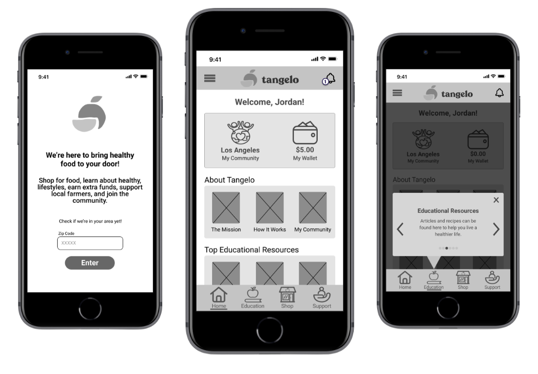
I also built out the new Education section —a key priority for both users and stakeholders. While the mobile app had some educational resources, such as recipes, users expressed confusion and difficulty finding relevant content within the Explore page.
To increase discoverability, I integrated two ways to access educational resources:
Created a section on the Home page to feature top educational resources
Added a dedicated Education section in the bottom navigation for casual browsing
Eventually, the client hoped to expand the functionality to allow users to earn supplemental funding for healthy food by completing specific tasks, such as reading educational content. So, having various ways to access this content would help users access additional funding and food faster.
Usability Testing
All tests were moderated remotely due to the geographic diversity of participants and to comply with social distancing guidance.
We conducted 5 total usability tests over 2 rounds, adjusting the prototype between rounds to gain more meaningful insights from usability testing.
After the first round, we observed some common issues:
Users moved quickly through the sign-up flow without reading the content
Instinctual reactions were to close out the orientation tooltips
Layouts felt crowded and very text-heavy

As such, we adjusted the prototype, hoping to gain more meaningful insights from usability testing. We did see improvements in the testing metrics, such as:
Significant decrease in time spent on task
Increase in overall completion rate
Decrease in average number of errors
Task completion (0-2 scale): 0 = Incomplete, 1 = significant difficulty, prompting or workaround, 2 = Completed with ease
Findings & Recommendations
Key Findings:
All participants signed up easily, but felt there was still too much text.
Onboarding was somewhat easy across the board, though one participant clicked out of the flow completely.
Finding a recipe produced the most errors, as participants tended to navigate to Market instead of Education.
All participants successfully joined the #LetsFeedLA program with 0 errors and little difficulty.
Recommendations:
Reduce/clarify text and integrate visuals.
Make possible actions learnable without tooltips.
Conduct card sorting or other testing to determine the need for different labeling and organization.
Develop different versions of earning opportunities or programs that can easily scale as the user base grows.
Deliver
We received positive feedback from the client and other stakeholders who appreciated our storytelling, design work, and thoughtful approach.
The low-fidelity MVP shifted Tangelo to a direct-to-consumer model, decreased user confusion, and empowered users through healthy food, education, and financial support. Some key updates included:
Consolidating the sign-up flow, allowing users to create an account more easily.
Integrating an onboarding flow to educate new users and increase retention.
Restructuring the IA to facilitate a more streamlined and cohesive user experience.
Redesigning the Home page and building the Education section to prioritize helpful content.
Adding an activity modal notifying users of new earning opportunities they could opt into.
At the project’s conclusion, I packaged our final deliverables and managed the hand-off to the client.

“I could really feel your heart in it. There are talented people everywhere, but your heart and soul are what will take you to these beautiful moments in life. You did great work! I’m really, really, really proud.”
Potential Next Steps
If we had more time to work on this project, I would have liked to take some additional actions to continue improving the product.
Conduct additional research, including:
competitor analysis on Walmart and Amazon;
interviews and/or testing with more experienced Tangelo users; and
testing the navigational labels and content organization.
Create wireframes for the rest of the ecosystem, such as:
building out the Wallet;
redesigning the Market; and
creating and optimizing the Menu and Notifications pages.
Add a ‘Right to delete’ information in account settings.
Expand the Education section to include webinars, videos, and SNAP-Ed content.
Elevate designs to mid- and high-fidelity, including UI elements and final copy.
Reflection
Some of my takeaways included key soft skills and general best practices when collaborating in Figma.
Clear and consistent communication is important!
Have a plan and be flexible, especially when engaging clients with busy schedules and limited availability.
Keep asking questions —you don’t know what you don’t know, so keep digging further!
Always, always, always advocate for the users.
Make edits on a separate Figma page and not directly in the working prototype.
Use comments in Figma to ask clarifying questions and track edits.